Overview
I was the Principal Product Designer in rebuilding Consumer Edge's B2B Fintech Analytical SaaS product.
Through iterative prototyping, pixel-perfect design, and strategic leadership, I led a design team that changed the Alternative Data industry.
The Challenge
Power users need to analyze multiple cuts of data simultaneously, while users with less time and analytical prowess want insights delivered without putting in much effort.
Ultimately, we built an analytics platform that revolutionized alternative data for a vastly underserved audience.
Deliverables
- User Experience Research
- User Interface Design
- Figma Prototypes
- Full Design Documentation for Engineering Hand-off
My Role
- Principal Product Designer
- Product Strategy & Vision
- High-Res Designs & Interactive Prototyping
- UX Research
- Engineering & Senior Leadership Partnership
- Live Demoing & Presentation
Timeline
- 1.25 Years
Who I Worked With
- 1 Product Manager
- 2 UX Researchers
- 14 Internal Users (Data Science)
- 17 Fortune 500 & Hedge Fund Users
- 6 Engineers
- Senior Leadership
Visit Site
Step 1: Discover User Needs
Before engaging with internal and external clients, I reviewed the assets and presentations they offer to their clients to look for patterns of value delivery.
Next, my PM and I initiated the Interview portion to test assumptions and discover opinions.
Then we observed our users manually creating their presentations via contextual inquiry/field studies over Zoom.
We had noticed strong analysis patterns, so the architecture and requirements were gaining shape.
We had direction.
We discovered these main challenges;
Step 2: Low Res Designs & Tests
I started mapping user needs to functionality, and eventually to sections of the application.
First, I ran these designs by our TPM to ensure that I was on the right track. Next, our TPM and I went to Engineering and Data Science to ensure technical feasibility. This is where things got sticky.
We discovered loads of technical roadblocks that were considered permanent. Instead of limiting the solution, I found workarounds by working with Data Science and Product leadership first to understand the limitations and then create workarounds.
Once feasibility was confirmed, I presented the design to senior leadership. Things got sticky again. I had to explain the solutions and technical workarounds in layman’s terms, while illustrating their usefulness.
This took 3 meetings and revisions, but we had our plan by the end.
Our CTO yelled with glee– “Yes, now this is something to be excited about! [Eng Lead], I want your team to start making this today.”
I couldn’t have been happier.
I then demoed the product to users, got feedback, made many revisions, and finally felt ready to move into high res designs.
Next, it was time to build the Design System.
Step 3: High Res Design
The needs for this Design System were not like most– it needed to fit two products with unique branding and functionality. One for Hedge Funds (Investors– the users I am currently building for) and one for Corporations (users whose needs I hadn’t yet investigated).
Next, I spoke with 4 corporate clients, created user personas, created feature lists via card sorting, and realized the needs were almost identical, minus terminology and the need to Forecast future performance of stocks.
So I then made the Design System in Figma, which served as the building blocks of our application. I considered Corporate users throughout, so I prepared some hidden component instances that I knew would serve this audience in the future.
I could assemble pixel-perfect screens with reusable components that gave users precisely what they needed within a delightful UI.
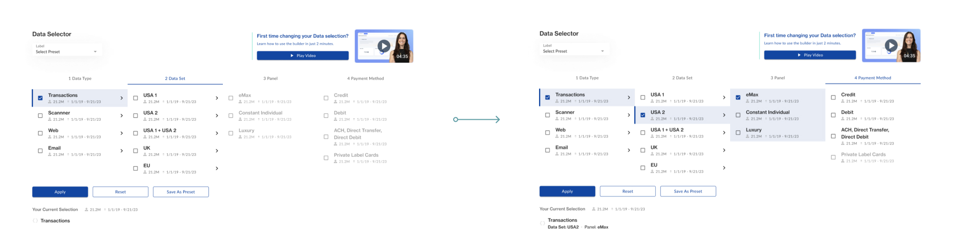
Since we discovered that users need to be able to make their own queries (aka graphs and tables), the usual process of creating developer notes explaining interactions, states, and user flows was more complicated than usual.
The product I designed had to be a System with consistent rules across queries, visualizations, and settings. Doing this makes the UX predictable and easy and makes Engineering work have fewer one-off builds.
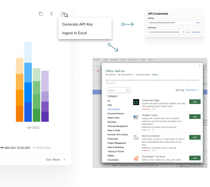
I worked with Engineering to design a dashboard creation system that revolutionized how users consume 3rd party data.
Problem & Solution
Design Callouts
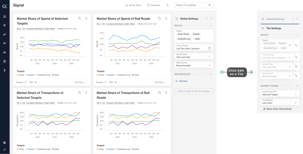
Edit Queries on the Fly
The Edit button on each tile allows users to customize their query and data viz settings.
Users can choose to set new filters and override global settings.
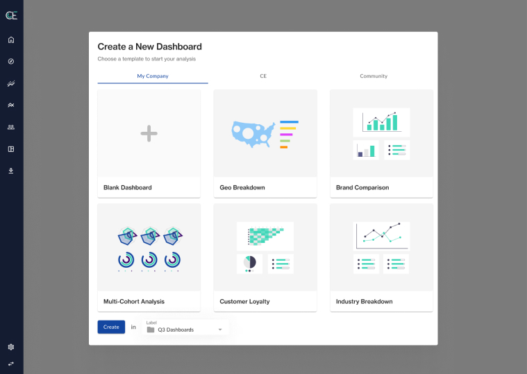
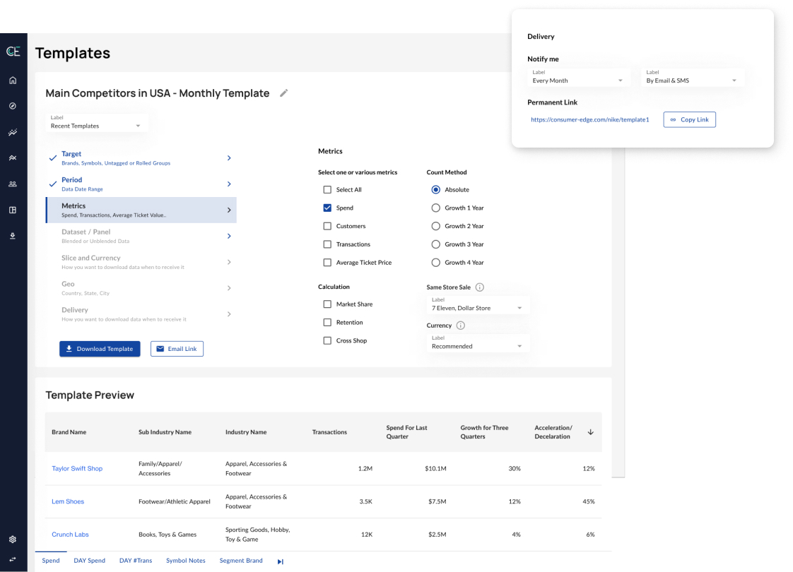
Create Dashboards, Duplicate Queries/Pages
Users can make their own collection of queries, named dashboards, which can be populated manually, from user-journey based templates, or from copied pages or graphs.
Problem & Solution
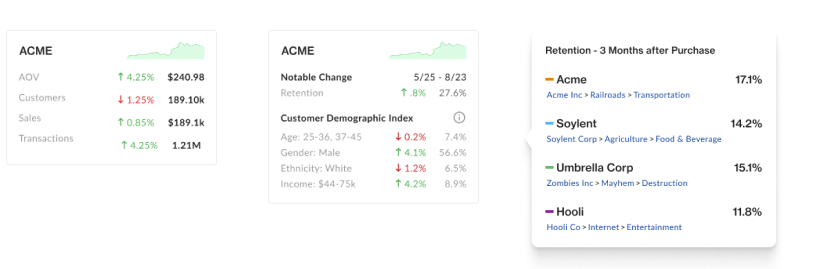
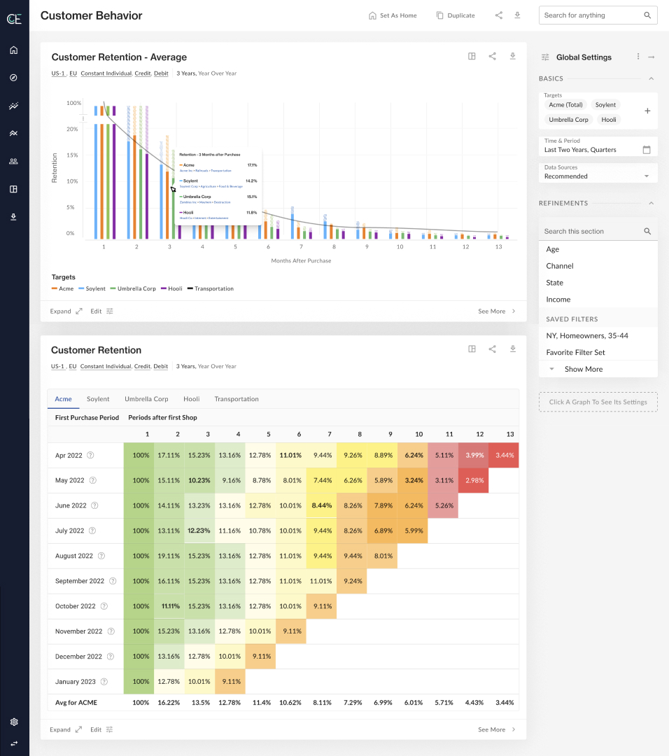
In “summary cards” (below, left) users can click any KPI or Demographic Attribute and see a deep-dive/graph about it. In the graph tooltip (Below, right), you can see the brand’s company, sub-industry, and industry, which establishes context and allows users to click and visit any of these “targets”.
We found that our users have multiple brand and customer investigation phases.
Through each of these phases, they will have many questions that we answer via data visualizations. There is no linear path in their investigations, and the questions from one phase overlap with questions in other phases.
For this reason, we decided to make KPI-based pre-made pages that serve specific user needs. Users can then easily switch between pages, answering their questions in whatever order they need.
Pages were set up to solve all related questions to the KPI that the page focuses on.
Below, the user can compare the average retention of multiple targets (first graph), then dig deep on a single target and its many first-purchase cohorts.
Problem & Solution
Problem & Solution
Step 4: Usability Testing & Benchmarking
My TPM and I showed the Figma Prototype to internal and external users to observe;
- how users interacted with the interface
- what questions they asked
- what they were confused about, using contextual inquiry
- where they looked and clicked the most, using heat-mapping and eye tracking
After making small tweaks to design and functionality, it was time to get this into development with Engineering.
Step 5: Implementation & Tweaks
Since I have engineering experience, writing notes that engineers can understand was easy. The handoff was as smooth as ever, but that doesn't mean that I had considered all of the edge-cases.
Luckily, I got to work with some talented and thoughtful Engineers, who communicated limitations and issues that lead to adjustments in design.
Since I know the lingo and how they think, coming to solutions together was a breeze.
Impact
Sales are up 160% despite the product only being half-built. We expect a banner year by the time every feature is fully implemented.