Overview
I worked with a friend I met in the microdosing subreddit to conceptualize, research, design, and develop this mobile app.
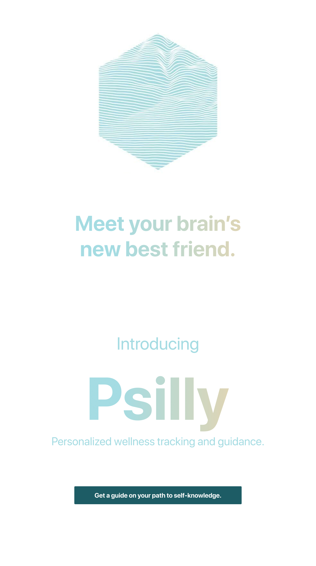
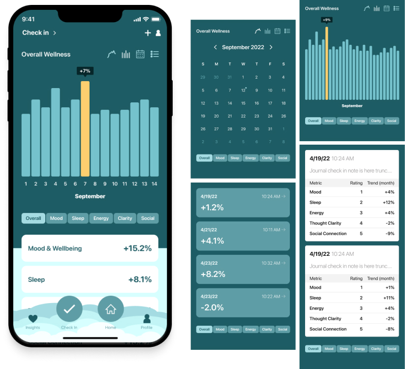
This first-of-its-kind mental health journaling app combines well-being notes with drug-stack ingestion in a time series/calendar to give you analytics on your mental health journey.
Spot peaks and valleys, and adjust your life’s course accordingly.
The Challenge
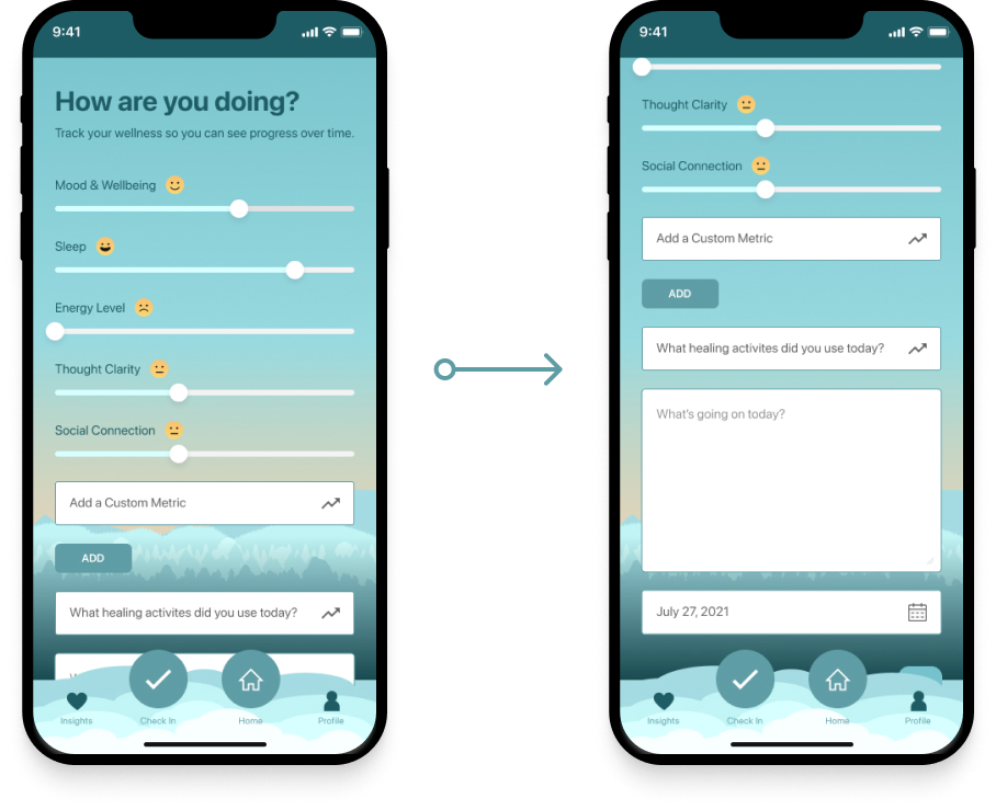
Users want to be able to journal about their well-being so they can recall details, while simultaneously being able to see the big picture to understand trends in their wellness while adjusting their lifestyle habits and medicine intake.
Deliverables
- User Experience Research
- Brand Design
- User Interface Design
- Figma Prototypes
- Full Design Documentation for Engineering Hand-off
My Role
- Co-founder
- Lead Product Designer
- Product Vision & Thinking
- Solo Designer of the Entire Application
- UX Research
- Competitive Analysis
Timeline
- 9 Months
Who I Worked With
- 1 Lead Engineer (my co-founder)
- 47 Internal Users
Get Psily

Step 1: Discover User Needs & Review Competition
Before engaging with internal users and hitting Figma, I reviewed competition to perform a SWOT and get some brand direction.
After investigating alternative solutions, and brands that fit our target audience, my co-founder and I established the visual direction and tone of voice.
Next was penciling out features for the MVP and getting some branding exercises going.
We discovered these main challenges;
Step 2: Establishing the Brand Feel
Through internal investigation and conversations with users, we discovered a theme: we all want a place to put our thoughts (a listener) and a way to get perspective and help (assistance).
That’s when we figured out our brand feel; a caring, calming friend who shows you the way.
Since both founders (myself, and Pat), are from New York and we admire the nature upstate so much, we decided to incorporate that into our brand imagery.
In comes calming colors and a topographic map logo.
Next, it was time to use this to build the Design System.
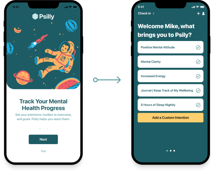
Step 3: Designing the Mobile UI
Since we had user feedback from community mental health and microdosing forums and our feedback form on the beta of Psily, we had clarity on how to solve user needs. Next, my job was to design an interface around this while incorporating our brand feel.
Using Figma, I created the design system that would serve as the building blocks of our application.
After exploration of the design system and establishing its patterns, assembling the UI to match our Jira stories was an iterative process, with many rounds of feedback and revision.
Throughout this process, I worked in React Native and with our Lead Engineer to establish technical feasibility. Through persistent communication, we set a path for making small tweaks to maintain application stability.
Since we had user feedback from community mental health forums, the microdosing subreddit, and our feedback form on the beta of Psily, we had clarity on how to solve user needs. Next, my job was to design an interface around this while incorporating our brand feel.
Using Figma, I created the design system that would serve as the building blocks of our application.
After exploring the design system and establishing its patterns, assembling the UI to match our Jira stories was an iterative process, with many rounds of feedback and revision.
Throughout this process, I worked in React Native and with our Lead Engineer to establish technical feasibility. Then, through persistent communication, we set a path for making minor tweaks to maintain application stability.
I built documentation into the process by creating developer notes that explained interactions, states, and user flows so that Engineering hand-off would be smooth.
After 2 months, we had our V1.
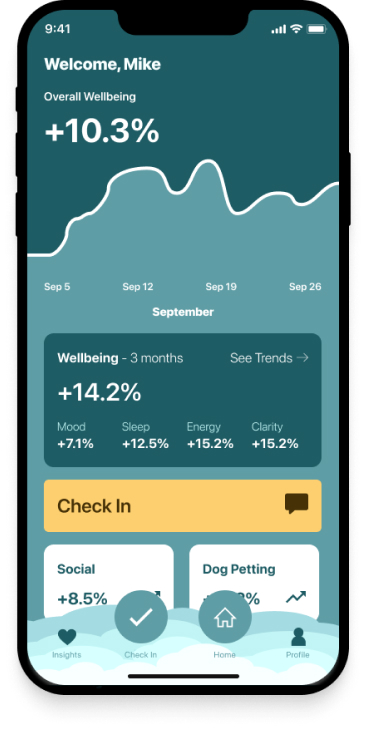
Some users appreciate splines, some need bars, while some need to avoid graphs altogether.
Designing the Website
With the brand feel and mobile interface established, it was time to apply this styling to a desktop and mobile website design.
Using Figma, I created the design system, that would serve as the building blocks of our application.
Once this was built, I could assemble pixel-perfect screens with reusable components that gave users precisely what they needed within a delightful UI.
Now what?
We are taking user feedback and writing up the plans for V2 of Psily.
The next feature is using machine learning to predict dips in well-being and suggesting activities to counteract this.
When we said that Psily is your brain's new best friend, we meant it.