Overview
I worked as the lead UX Designer to rebuild their flagship SaaS product.
Through iterative prototyping and demoing, we built a product that changed the TV Analytics industry.
The Challenge
Power users need to compare 3 metrics simultaneously, executive users want a quick takeaway summary, and less sophisticated users have trouble reading even basic graphs.
We had our work cut out for us.
Deliverables
- User Experience Research
- User Interface Design
- Figma Prototypes
- Full Design Documentation for Engineering Hand-off
My Role
- Lead Product Designer
- Product Vision & Thinking
- Solo Designer of the Entire Application
- UX Research
- Live Demoing & Presentation
Timeline
- 1.25 Years
Who I Worked With
- 1 Technical Product Manager
- 1 UX Researcher
- 4 Internal Users (Data Science)
- 17 Fortune 500 Clients/Users
- 6 Engineers
- Senior Leadership
Visit Site
Step 1: Discover User Needs
Before engaging with internal and external clients, I reviewed the assets and presentations they currently offered to their clients to look for patterns of value delivery.
Next, my TPM and I initiated the Interview portion to test assumptions and discover opinions.
Then we observed our users manually creating their presentations via contextual inquiry/field studies over zoom.
We had noticed strong analysis patterns, so the architecture and requirements were gaining shape.
We had direction.
We discovered these main challenges;
Step 2: Low Res Designs & Tests
After mapping out sections and functionality to UI components, I ran my designs by my TPM and Engineering lead to confirm that my design was technically feasible and fulfilled the user's needs.
I then communicated the design to senior leadership to confirm that the design was in line with company goals.
Tears of joy were shed by our CPO (yes, really).
After getting confirmation, I presented variations of the app-to-be, via Figma Prototypes, to our users and gathered feedback regarding the efficacy of each section and feature.
Through iterative updates, presentations, and feedback gathering, the order and inclusion of sections of the application became clear.
It was at this point that I knew that high resolution designs were needed.
Next, it was time to build the Design System.
Step 3: High Res Design
I made the Design System in Figma, which served as the building blocks of our application.
Once this was built, I could assemble pixel-perfect screens with reusable components that gave users precisely what they needed within a delightful UI.
I knew that I would pass this off to Engineering soon enough, so I built documentation into the process by creating developer notes explaining interactions, states, and user flows.
Problem & Solution
Design Callouts
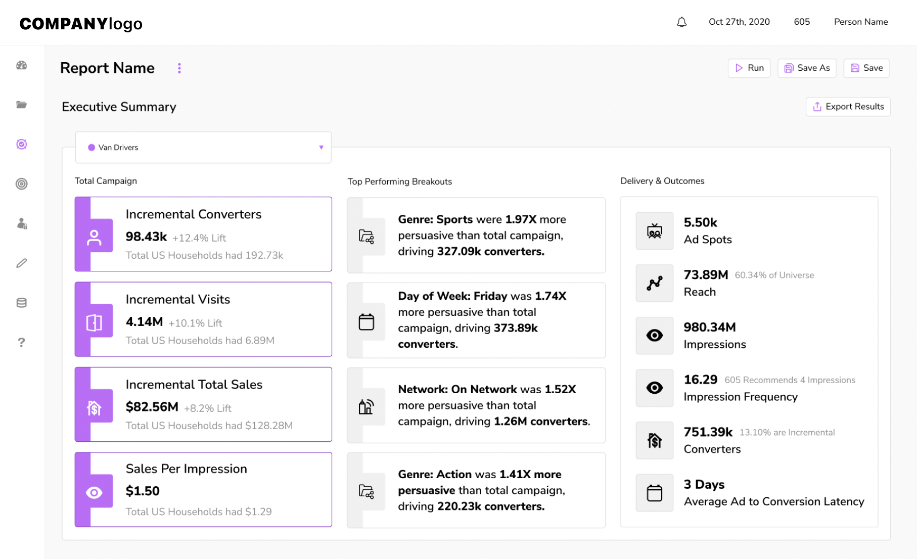
Purple Highlight Cards: Left-most column
To make the most critical metrics easy to scan. Comparing these performance metrics
to the baseline gives the user full context.
Human Readable Language: Center column
The user’s target audience is compared to the baseline, outlining its performance.
Main Stats Multi-card: Right-most column
So the viewer has full context on the campaign exposure.
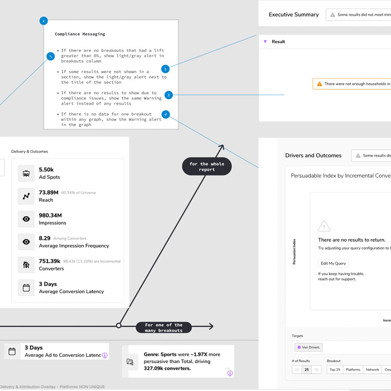
Problem & Solution
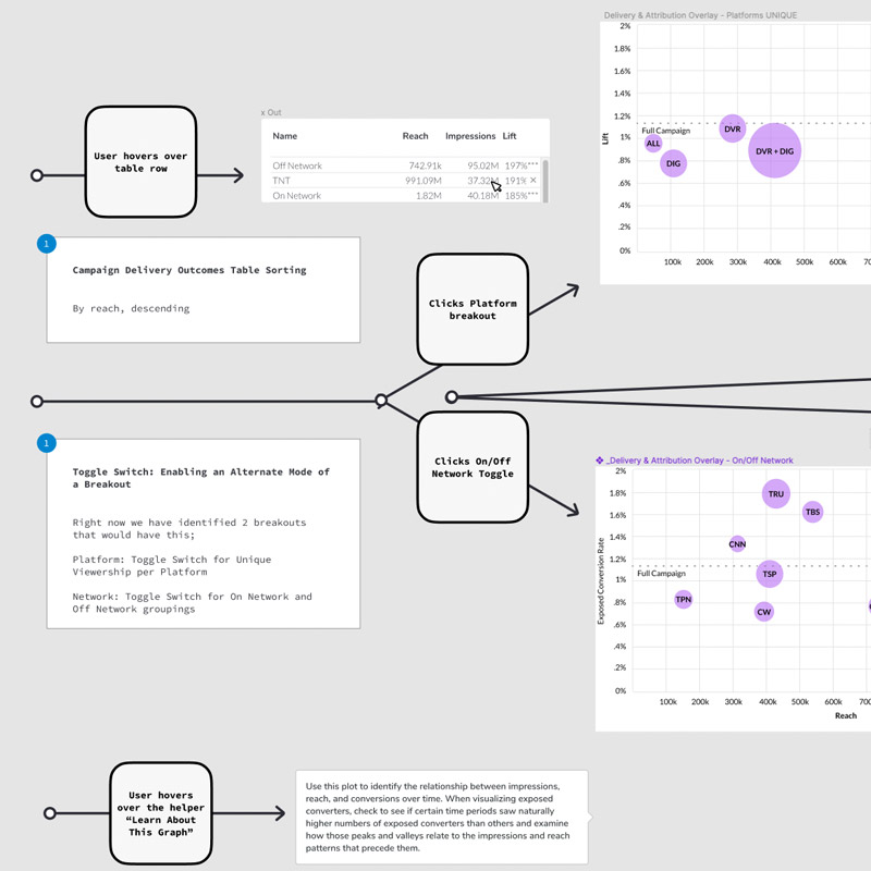
We discovered which metrics to group since comparing them didn’t make sense and provided button groups for each axis. After users expressed the need to reference other metrics which weren’t currently visualized, we put them into the data-point tooltips.
Design Callouts
Legend / Audience Selector Hybrid
Instead of dedicating part of the interface to a legend,
we saved space by combining this with
the Target Select/dropdown.
All Stats Tooltip
The user can see all performance metrics as they hover
over data points.
Mode Toggle/Switch
Provides alternate groupings of data.
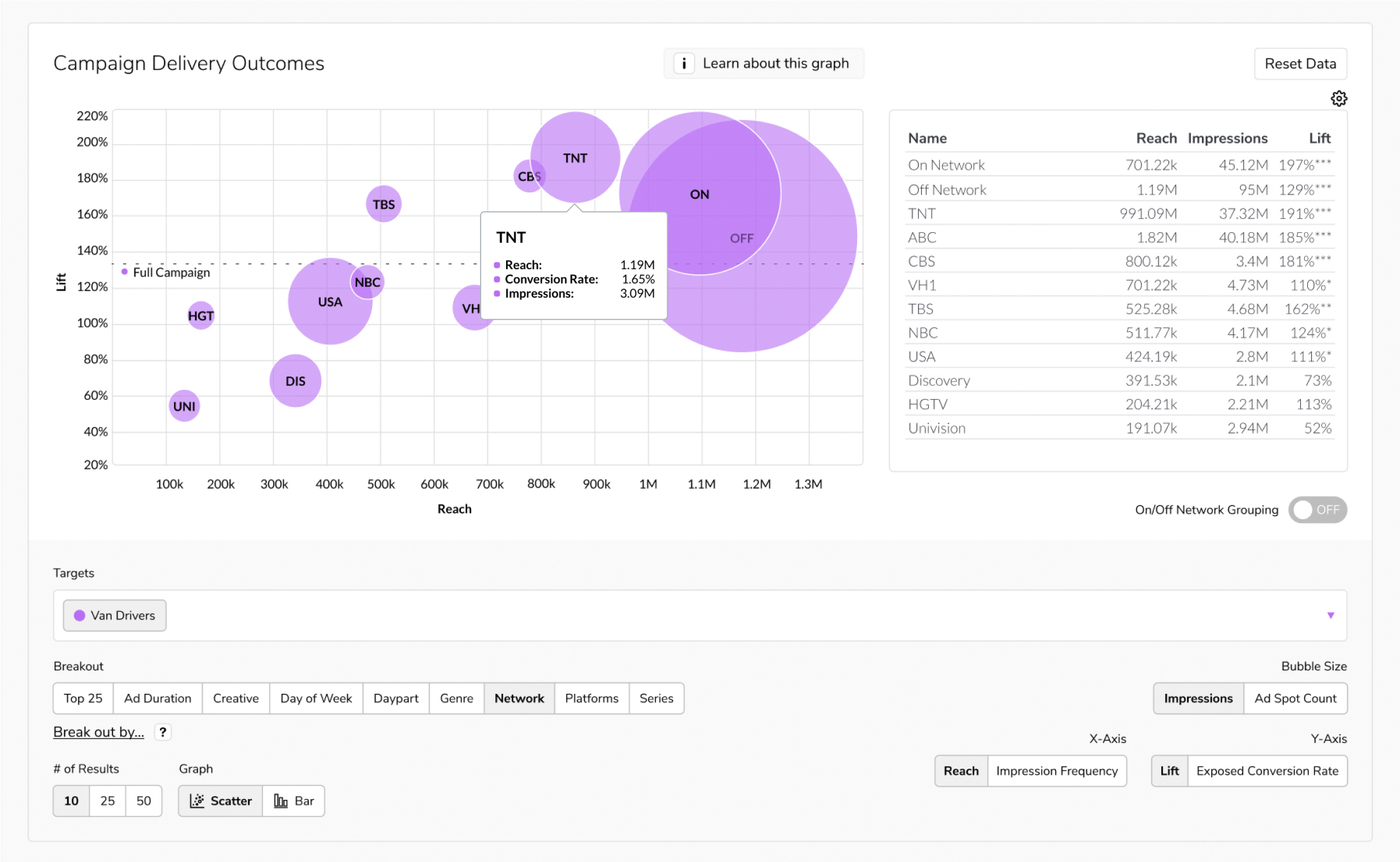
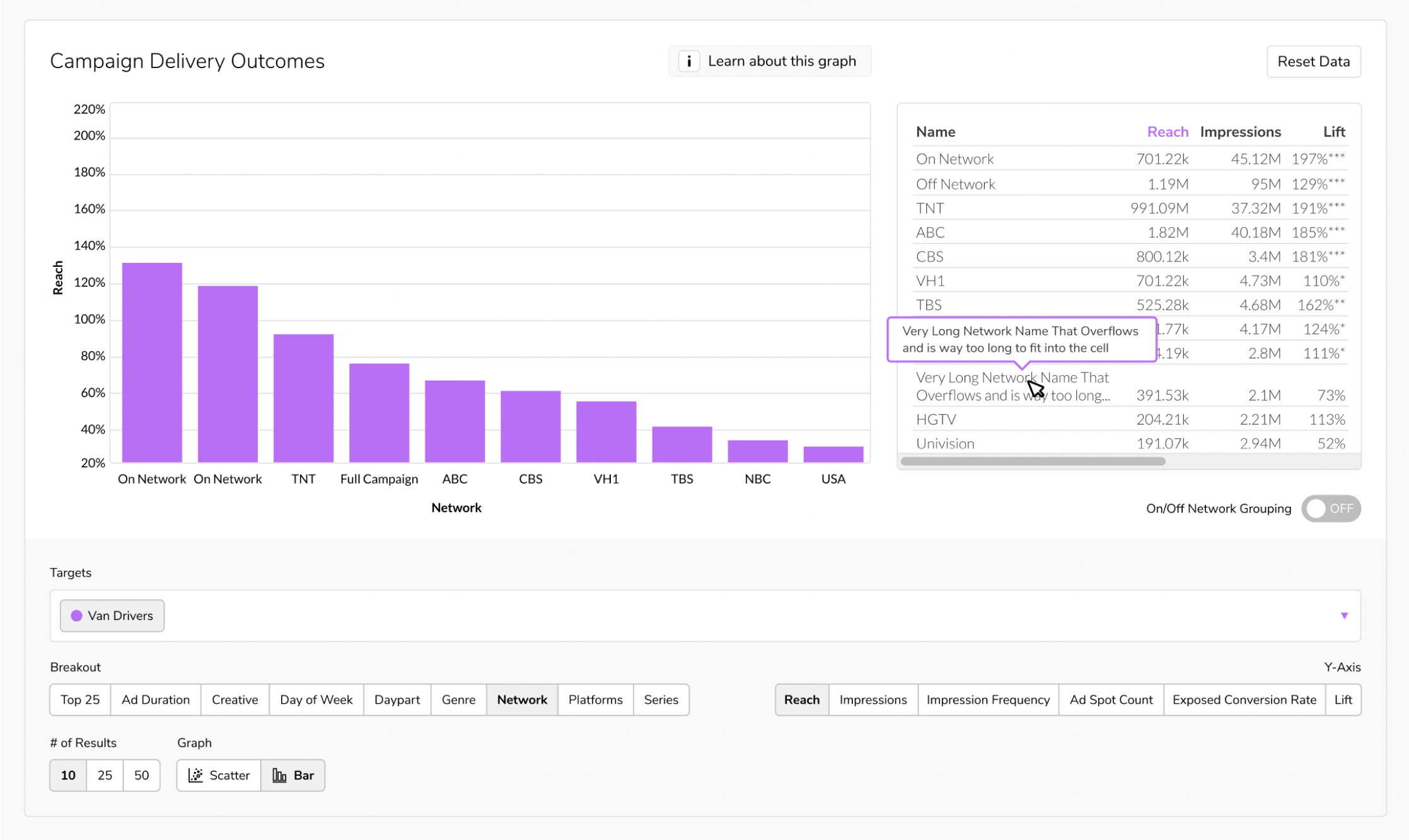
Problem & Solution
We had to meet users where they were. Despite building a super powerful 3 metric comparison tool with the scatter plot, we decided to add in a simple bar graph view so that users could focus on one metric at a time.
Design Callouts
Graph Button-group: Scatter vs Bar
The iconography makes it easy for the user to pick
the graph that makes it easiest for them to read.
Table Head: Highlighted Metric
Draws attention to the current metric of choice.
Combined Y-Axis Metric Selections
All available metrics that were previously separated
button-groups are now combined into one large button-group.
Step 4: Usability Testing & Benchmarking
My TPM and I showed the Figma Prototype to internal and external users to observe;
- how users interacted with the interface
- what questions they asked
- what they were confused about, using contextual inquiry
- where they looked and clicked the most, using heat-mapping and eye tracking
After making small tweaks to design and functionality, it was time to get this into development with Engineering.
Step 5: Implementation & Tweaks
Since I have engineering experience, writing notes that engineers can understand was easy. The handoff was as smooth as ever, but that doesn't mean that I had considered all of the edge-cases.
Luckily, I got to work with some talented and thoughtful Engineers, who communicated limitations and issues that lead to adjustments in design.
Since I know the lingo and how they thing, coming to solutions together was a breeze.